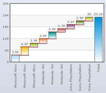
A Waterfall/Cascade chart is a special type of column chart. A waterfall chart lets you show how a value increases or decreases to come to a final value.
Learn how to:
- Add a summation column as the last column
- Specify conditional column colors
- Connect columns using lines
- Customize animation and style effects of the connecting lines
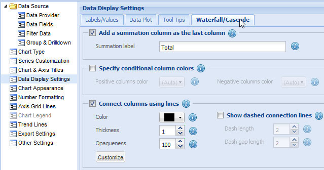
Add a summation column as the last column
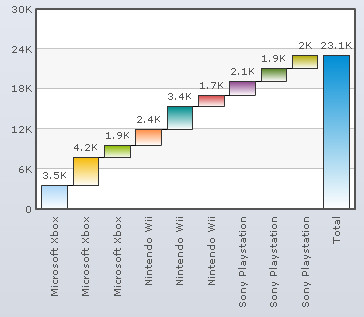
Select the Add a summation column as the last column check box to add an extra column displaying the total of all the data values. By default, this setting is turned on and the summation column is displayed.
Click Preview to view the change.
![]()
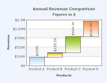
To hide the summation column, clear the Add a summation column as the last column check box and click Preview to view the change.
![]()
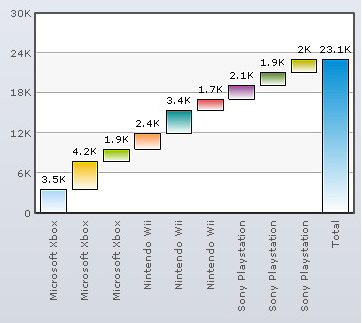
A Waterfall/Cascade Chart without the summation column looks as under:
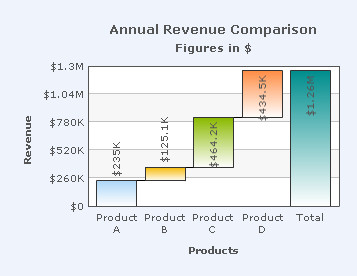
Enter the name in the Summation label text box to add a label to the summation column. Click Preview to view the change.
![]()
A Waterfall/Cascade chart displaying the summation label looks as under:
Note:
Click Apply to apply the changes made.
Click Revert to undo the changes.
Specify conditional column colors
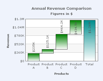
To set distinct colors for positive value columns and negative value columns select the Specify conditional column colors check box and click Preview to view the change.
![]()
To set distinct color of positive and negative columns you can:
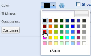
- Choose a color from the Positive columns color drop-down color picker. Select (Auto) to allow the chart to decide the color automatically.
- Choose a color from the Negative columns color drop-down color picker. Select (Auto) to allow the chart automatically decide the color.
- Click Preview to view the changes.
![]()
A chart with the above settings looks as under:
Note:
Click Apply to apply the changes made.
Click Revert to undo the changes.
To connect the columns using lines, select the Connect columns using lines check box and Preview changes to view the change. By default, the check box remains selected and the columns are connected.
![]()
To disconnect the columns using lines, clear the Connect columns using lines check box and click Preview to view the change.
![]()
To configure the connecting lines you can:
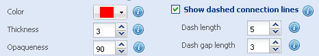
- Choose the color from the Color drop-down color picker to set the color of the connecting lines. Select (Auto) to let the chart automatically decide the color.
- Select or enter a value in the Thickness box to set the thickness of the connecting lines.
- Set the opaqueness of the connecting lines by selecting or entering a value between 0-100 in the Opaqueness box.
The lowest value 0 will make the grid lines completely transparent and invisible; and the highest value 100 will make them completely opaque.
- Select the Show dashed connecting lines to display the connecting lines as dashed.
- Select or enter a value in the Dash length box to specify the length of each dash.
- Select or enter a value in the Dash gap length box to specify the gap between each dash.
- Click Preview to view the changes.
A chart with the above settings is shown below:
Note:
Click Apply to apply the changes made.
Click Revert to undo the changes.
Customize animation and style effects of the connecting lines
You can add styles and effects to the connecting lines. Click the Customize button that will open the Customize Styles dialog box window that allows you to do the following: