Trend lines are special horizontal lines on the chart canvas that help in highlighting certain values on the chart scale.
Trend lines serve as visual indicators of the criteria that are used for evaluating the plotted data and help you to interpret chart data better. For example, in a chart representing sales figures for a product, a trend line can highlight the target sales value or the expected sales value.
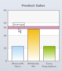
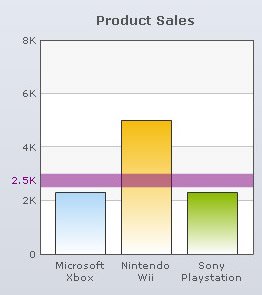
A trend zone is similar to a trend line in terms of functionality; but it covers a range of values with a lower and an upper limit.
You can create multiple trend lines and trend zones on a chart.
Note: Trend lines are not available for Pie, Doughnut, Funnel, Pyramid, Radar charts.
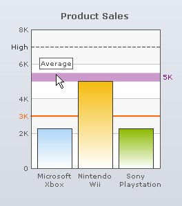
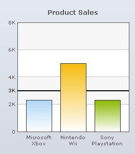
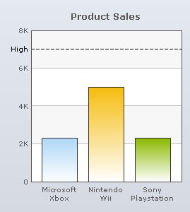
A chart showing trend lines and trend zone looks as under:
Learn how to:
- Create a Trend Line
- Create a Trend zone
- Display custom text for the Trend Line or Trend zone
- Display custom Tool-tip text for the Trend Line or Trend zone
- Customize the appearance of the Trend Line or Trend zone
- Display the Trend Line or Trend Zone over the data plots
- Shift the value of the Trend Line or Trend zone to the right side
- Plot the Trend Line or Trend zone on the secondary axis
- Configure the Trend Line as dashed
- Add and delete Trend Lines
- Customize font style of Trend Values
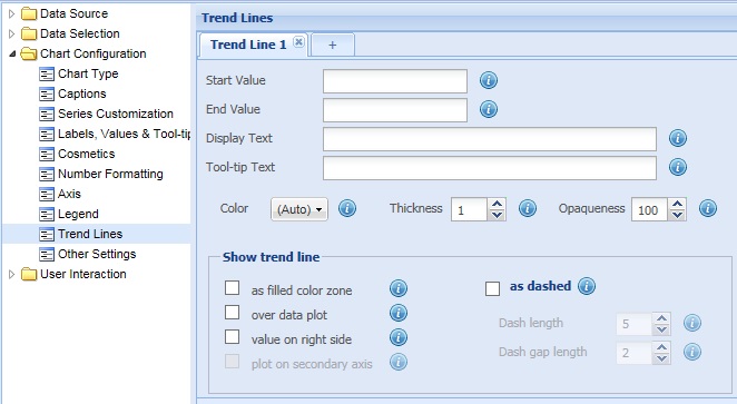
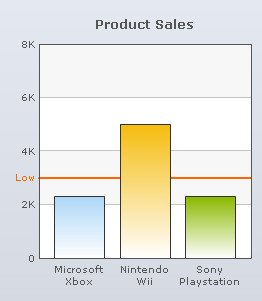
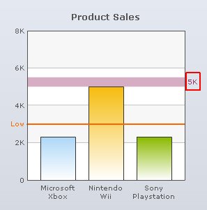
The steps to create a trend line are as follows:
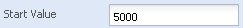
- In the Start Value text box, enter the value from which you want the trend line to start.
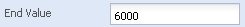
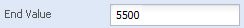
- In the End Value text box, enter the value at which you want the trend line to end. You can ignore this setting or set the equal of the start value, if you wish to create a horizontal trend line.
- Click Preview changes to view the changes.
A chart displaying trend line looks as under:
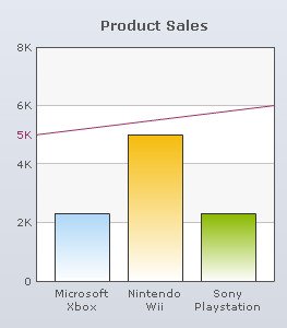
If the start value and end value of the trend line are the same, the result is a straight trend line. Any difference in the start value and end value would result in a slanted trend line.
The steps to create a slanted trend line are as follows:
- In the Start Value text box, enter the value from which you want the trend line to start.
- In the End Value text box, enter the value at which you want the trend line to end.
- Click Preview changes to view the changes.
A chart with slanted trend line looks as under:
Note:
Click Apply changes to apply the changes.
Click Revert changes to undo the changes made.
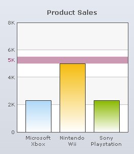
The steps to create a trend zone are as follows:
- In the Start Value text box, enter the value from which you want the trend zone to start.
- In the End Value text box, enter the value at which you want the trend zone to end.
Note: It is compulsory to provide an End Value to create a trend zone.
-
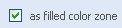
Select the as filled color zone check box, else the trend zone will be displayed as a slanted trend line.
- Click Preview changes to view the changes made.
Note: It is mandatory to have different start and end values to display a trend zone. If there is no difference between the start and end values, the trend zone will not appear.
A chart showing trend zone looks as under:
Note:
Click Apply changes to apply the changes.
Click Revert changes to undo the changes made.
Display custom text for the Trend Line or Trend zone
Enter the intended title for the trend line or trend zone in the Display Text text box and click Preview changes to view the change. You can leave this field blank if you wish to show the value itself as the label of the trend line.
![]()
A chart with custom text for the trend line looks as under:
Note:
Click Apply changes to apply the change.
Click Revert changes to undo the change made.
Display custom Tool-tip text for the Trend Line or Trend zone
A tool-tip displays additional information about the trend line or trend zone. A tool-tip appears when you hover over the trend line or trend zone.
In the Tool-tip Text text box, define the desired text that is to be displayed in the tool-tip. Click Preview changes to view the change.
![]()
A chart with custom tool-tip text looks as under:
Note:
Click Apply changes to apply the change.
Click Revert changes to undo the change made.
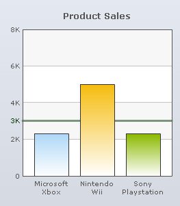
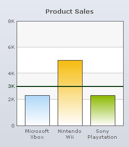
Customize the appearance of the Trend Line or Trend zone
To customize the appearance of the trend line or trend zone you need to change the following settings:
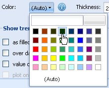
- Choose any color from the Color drop-down color picker to customize the color of the trend line or trend zone. Select (Auto) to let the chart decide the color automatically.
- Set the thickness of the trend line by selecting or entering the appropriate value in the Thickness box.
Note: This field becomes deactivated if you select the as filled color zone check box.

- Set the opaqueness of the trend line or trend zone by selecting or entering a value between 0-100 in the Opaqueness box.
The lowest value 0 will make trend line or trend zone completely transparent and invisible; and the highest value 100 will make it completely opaque.

- Click Preview changes to view the changes made.
A chart with customized trend line looks as under:
Note:
Click Apply changes to apply the changes.
Click Revert changes to undo the changes made.
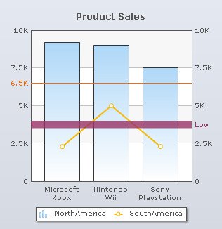
Display the Trend Line or Trend Zone over the data plots
You can display the trend line or trend zone over the data plots to make it more prominent. By default, this feature is disabled and is not applicable to 3D charts.
Select the over data plot check box to display the trend Line or trend zone over the data plots. Click Preview changes to view the change.
![]()
A chart showing trend line over the data plots looks as under:
A chart showing trend zone over the data plots looks as under:
Note:
Click Apply changes to apply the change.
Click Revert changes to undo the change made.
Shift the value of the Trend Line or Trend zone to the right side
You can show the value of the trend line or trend zone on the right side of the chart. Select the value on right side check box to shift the trend line or the trend zone value to the right. By default, the value appears on the left side of the chart. Click Preview changes to view the change.
Note: This feature is not applicable to Dual Y-Axis charts.
![]()
A chart with value of the trend line on the right side looks as under:
Note:
Click Apply changes to apply the change.
Click Revert changes to undo the change made.
Plot the Trend Line or Trend zone on the secondary axis
You can plot the trend line or trend zone to highlight the values of the secondary Y-Axis in a Dual Y-Axis chart. By default, the trend line or trend zone is bound to the primary Y-Axis on the left. This feature is applicable to Dual Y-Axis charts only.
Select the plot on secondary axis check box to plot the trend line on the secondary axis. Click Preview changes to view the change.
![]()
A chart with trend line plotted on the secondary Y-Axis looks as under:
Note:
Click Apply changes to apply the change.
Click Revert changes to undo the change made.
Configure the Trend Line as dashed
You can display the trend lines as dashed or broken lines. This feature is not applicable to trend zones.
To display the trend lines as dashed select the as dashed check box and click Preview changes to view the change.
![]()
Note: To display the trend lines as continuous lines, clear the as dashed check box. On clearing this check box, all the related fields are deactivated.
To configure the length of each dash and to set the space between each dash you need to:
- Select or enter the length of each dash (in pixels) in the Dash Length box.
- Select or enter the amount of gap (in pixels) between each dash in the Dash Gap Length box.
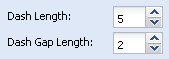
- Click Preview changes to view the changes made.
A chart with customized dashed trend line looks as under:
Note:
Click Apply changes to apply the changes.
Click Revert changes to undo the changes made.
You can add multiple trend lines or trend zones to a chart.
Click ![]() to add more trend lines or trend zones.
to add more trend lines or trend zones.
To delete a trend line or trend zone, click ![]() .
.
Customize font style of Trend Values
You can change the font style of the Trend Values. Click the Customize values button. The Customize font dialog opens. Create new font styles. To know more, visit how to change font style.