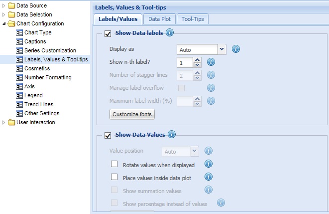
Labels refer to the names of the dataplots (columns, line/area/scatter/bubble) which appear below the X-Axis. They help in identifying individual data plots on the X-Axis.
Data values refer to the values of the dataplots (columns, line/area/scatter/bubble, pie or doughnut slices).
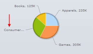
In the image above, data labels have been highlighted in red and data values have been highlighted in green.
Learn How to:
- Show or hide data labels
- Display data labels in different display modes
- Manage overflow of long data labels
- Limit the width of the data labels
- Show or hide data values
- Rotate data values
- Place data values inside data plots
- Show percentage as data values
- Customize fonts
To show the data labels select the Show Data labels check box and click Preview to view the change. By default, the check box remains selected and the data labels are displayed.
![]()
To hide the data labels, clear the Show Data labels check box and click Preview to view the change.
![]()
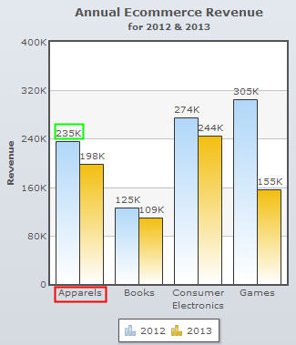
A chart with data labels is shown below:
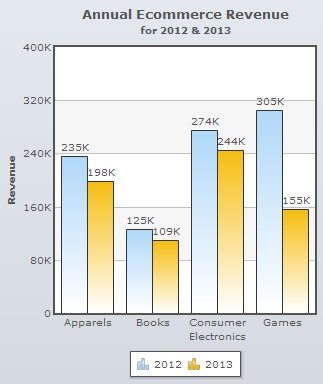
A chart without data labels looks as under:
Note:
Click Apply to apply the changes made.
Click Revert to undo the changes.
The data labels can be displayed in various display modes.
To specify the display mode of the data labels, you need to select an option from the Display as drop down list and click Preview to view the change.
Note: This setting is not available for Bar, Pie and Doughnut and Funnel/Pyramid charts.
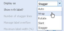
The options are as follows:
This is the default display mode where the chart automatically selects the best way to display the labels depending on the amount of space available. If there are a large number of data labels corresponding to the available space, then the data labels are either truncated or trimmed with ellipses (…), wrapped, or rotated.
The chart below demonstrates display of data labels in auto mode.

This mode trims the long data labels automatically when enough space is not available on chart and enables you to wrap the long X-Axis labels in multiple lines.
A chart with wrapped data labels looks as under:
In this mode, the X-Axis labels or the data labels are displayed vertically.
The chart below displays the data labels in rotated mode.
This mode allows you to display slanted data labels.
A chart displaying data labels in slant mode looks as under:
In stagger mode, the labels are displayed in multiple lines as steps.
On selecting the Stagger mode, the Number of stagger lines box becomes active. This setting determines the number of steps that the labels will be displayed in.
Select or enter the value in the Number of stagger lines box and click Preview to view the change.
![]()
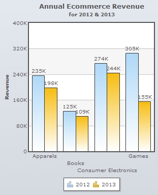
The chart below demonstrates the stagger mode of data labels. The number of stagger line is set to 3.
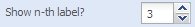
To display every n-th data label instead of all the data labels, select or enter a value in the Show n-th label? box and click Preview to view the change. The chart only displays the n-th label after the first data label, where n is the value provided. The first data label is always displayed.
Note: This setting is not applicable for Pie or Doughnut charts.
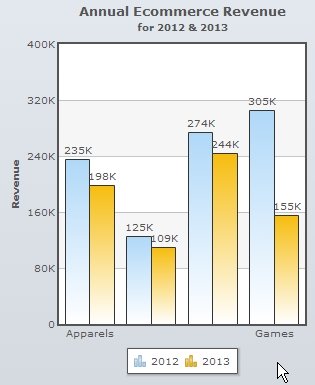
Here, we have set the value of n as “2”. Therefore, the chart will display the first data label and every 2nd data label after the first label. So, if a chart contains 9 data labels and the value is set to “2” the chart will display the first, third, fifth, seventh and the ninth data labels.
The chart will look as under:
Note:
Click Apply to apply the changes made.
Click Revert to undo the changes.
Sometimes your chart data may contain long data labels that are not fitting within the main chart area. As a result, your chart might look awkward and clumsy. This situation is known as label overflow.
To prevent such a scenario, select the Manage label overflow check box and click Preview to view the change.
![]()
This allows the chart to wrap the long data labels and try to fit them within the main chart area. Then also, if the data labels are overflowing, the chart truncates or trims the long labels using ellipses (…) to accommodate them within the main chart area.
Note: This setting is applicable only for pie and doughnut charts.
Note:
Click Apply to apply the changes made.
Click Revert to undo the changes.
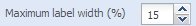
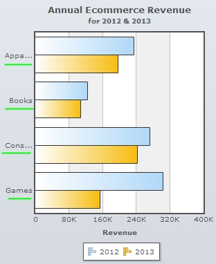
This setting determines the maximum horizontal width of the data labels in Bar charts.
Select or enter the value in the Maximum label width (%) box and click Preview to view the change. The value provided in the box is applied as percentage of the total available width of the chart.
For the value, set in the above screen shot the chart will look as under:
Note:
Click Apply to apply the changes made.
Click Revert to undo the changes.
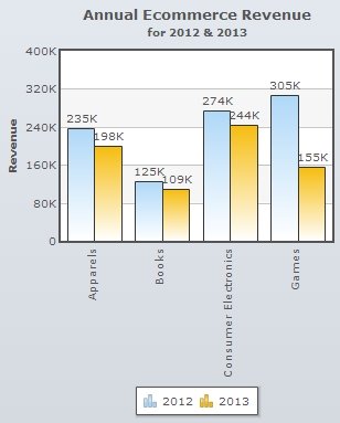
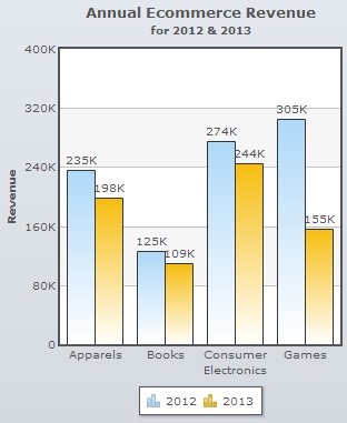
To show the data values select the Show Data Values check box and click Preview to view the change. By default, the check box remains selected and the data values are displayed.
![]()
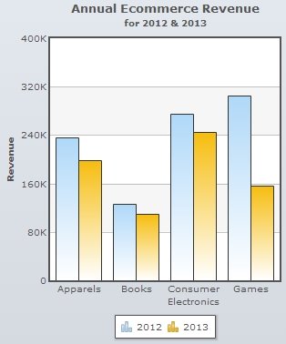
A chart displaying data values looks as under:
To hide the data values clear the Show Data Values check box and click Preview to view the change.
![]()
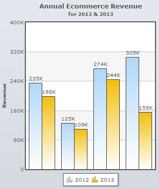
A chart without data values looks as under:
Note:
Click Apply to apply the changes made.
Click Revert to undo the changes.
In Pareto charts, the position of data values of the cumulative line can be displayed in various display modes.
To specify the display mode of the data values, you need to select an option from the Value position drop down list and click Preview to view the change.
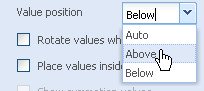
The available options are:
- Auto: This is the default display mode where the chart automatically selects the best way to display the values depending on the amount of space available.
- Above: In this display mode, the data values are displayed above the cumulative line.
- Below: In this display mode, the data values are displayed below the cumulative line.
By default, the data values are displayed horizontally. To display the data values vertically, select the Rotate values when displayed check box and click Preview to view the change.
![]()
Note: This setting is not applicable for Pie, Doughnut, Funnel/Pyramid and Bar charts.
A chart with rotated data values is shown below:
Note:
Click Apply to apply the changes made.
Click Revert to undo the changes.
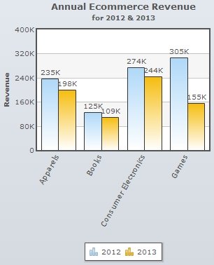
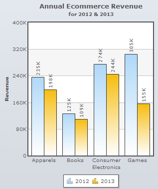
To display the data values inside the dataplots (columns and bars), select the Place values inside data plot checkbox and click Preview to view the change. This setting is applicable only for column and bar charts.
![]()
A chart displaying the data values inside the dataplots is shown below:

Note:
Click Apply to apply the change made.
Click Revert to undo the change.
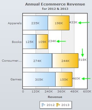
To display the total sum of each dataplot, select the Show summation values check box and click Preview to view the change.
![]()
Note: This feature is applicable only to stacked column and stacked bar charts.
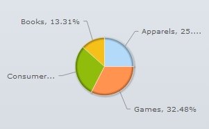
Show Percentage instead of values
To display percentage values instead of actual values, select the Show percentage instead of values check box and click Preview to view the change.
Note: This feature is applicable only to pie, doughnut, pyramid and funnel charts.
![]()
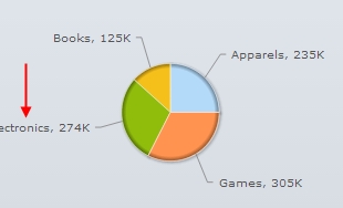
A pie chart showing data values in percentages looks as under:
Note:
Click Apply to apply the change made.
Click Revert to undo the change.
To change the font style of data labels and data values, click Customize fonts button. The Customize font dialog opens. Create new font styles. To know more, visit how to change the font styles.