
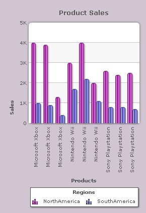
A legend is a rectangular box with the name of the data series and an icon representing the type of dataplots. It automatically appears at the base of a multi-series chart. Legend helps the viewer in associating dataplots with their respective series.
Chart Legend is not available in single series charts, except for pie and doughnut charts.
Learn how to:
- Display chart legend
- Create a Legend caption
- Change Legend position
- Create interactive Legends
- Determine the Legend key size
- Set the number of columns in the Legend area
- Reverse the order of legend keys
- Create Draggable legend
- Customize the Legend Background
- Customize the Legend Border
- Customize fonts of the Chart Legend
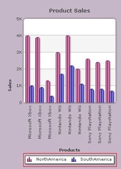
To show the legend box, click the Show chart legend check box and click Preview. By default, the check box remains selected and the legend is displayed.
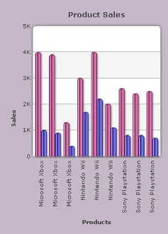
To hide the chart legend clear the Show chart legend check box and click Preview to view the change.
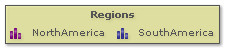
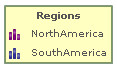
| A chart showing Legend | A chart without Legend |
 |
 |
Note:
Click Apply to apply the change.
Click Revert to undo the change made.
Legend caption refers to the title of the legend. It helps to indicate the correlation between the data series that are plotted on a chart. Enter the desired name in the Caption text box and click Preview to view the change.
A chart with custom legend caption looks as under:
Note:
Click Apply to apply the change.
Click Revert to undo the change made.
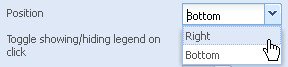
You can specify the position of the legend on the chart canvas by selecting from the Position list box. You can place the legend box at two alternative positions of the chart canvas, either at the Right side or at the Bottom. By default, it is placed at the bottom. Click Preview to view the changes.
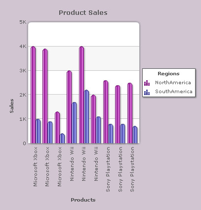
A chart with the legend at the bottom looks as under:
The chart below shows the legend at the right side:
Note:
Click Apply to apply the changes.
Click Revert to undo the changes made.
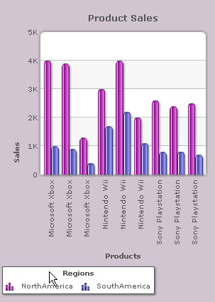
You can show or hide a particular data series if you want a better note of data plots on the chart. When you click a particular data series name or icon in the legend, its corresponding data plot disappears and reappears on re-click.
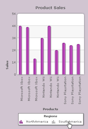
For pie and doughnut charts, the corresponding data plot slices-out on clicking and slices-in on re-click. The particular series name and icon in the legend become disabled when clicked.
In 3D Single Y Combination chart, only the data values associated with the dataplots show and hide when interactive legend items are clicked.
By default, interactivity is enabled.
Clear the Toggle showing/hiding legend on click check box to disable interactivity of the legend items. Click Preview to view the change.
| A chart with legend interactivity set on | A chart with legend interactivity set off |
 |
 |
Note:
Click Apply to apply the changes.
Click Revert to undo the changes made.
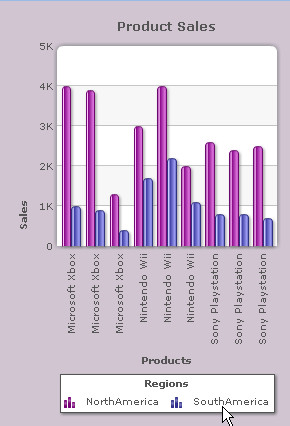
The icon corresponding to a particular data series represents the legend key. To determine the size (in pixels) of the legend key, select the value from the Size of legend key drop down list and click Preview to view the change. The minimum value is 0.5 and the maximum value is 5.
A chart legend set to 2 (in pixels) will look as under:
Note:
Click Apply to apply the change.
Click Revert to undo the change made.
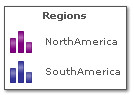
Set the number of columns in the Legend area
The legend box can be divided into a grid of horizontal rows. Legend items are arranged in these rows.
In the Number of rows in legend box, select or enter the number of rows into which you want to divide the legend area. Then click Preview to view the change.
This feature depends on the following:
- The chart area
- The number of legend icons
- The size of the legend icons
Note: This setting is applicable only when there is sufficient horizontal space for the rearrangement of the legend area.
The chart legend appears as shown below.
Note:
Click Apply to apply the changes.
Click Revert to undo the changes made.
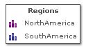
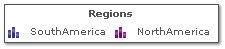
Reverse the order of legend keys
To reverse the default order in which the legend items appear in the legend area, just select the Reverse order check box and click Preview to view the change.
The chart legend appears as shown below.
Note:
Click Apply to apply the change.
Click Revert to undo the change made.
Collabion Charts for SharePoint allows you to create draggable legends. On enabling the Enable drag operation on legend check box, you can click the legend, drag it to anywhere on the chart, and graphically re-position on the chart canvas. Click Preview to view the change.
A chart with Draggable legend is shown below:
Note:
Click Apply changes to apply the changes.
Click Revert changes to undo the changes made.
Customize the Legend Background
To customize the background of the legend you need to change the following settings:
- Choose any color from the Color drop-down color picker to customize the color of the legend background. Select (Auto) to let the chart decide the color automatically.
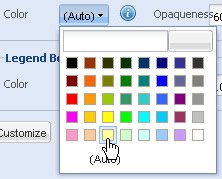
- Set the opaqueness of the legend background by selecting or entering a value between 0-100 in the Opaqueness box.
The lowest value 0 will make the legend background completely transparent and invisible; and the highest value 100 will make it completely opaque.

- Select the Shadow check box to add a shadow effect to the legend.

- Click Preview to view the changes made.
Here is an example of a customized legend background:
Note:
Click Apply to apply the changes made.
Click Revert to undo the changes.
To customize the legend border you need to change the following settings:
- Choose any color from the Color drop-down color picker to customize the color of the legend border. Select (Auto) to let the chart decide the color automatically.

- Set the opaqueness of the legend border by selecting or entering a value between 0-100 in the Opaqueness box.
The lowest value 0 will make the legend border completely transparent and invisible; and the highest value 100 will make it completely opaque.

- Set the thickness of the legend border by selecting or entering the appropriate value in the Thickness box.

- Click Preview to view the changes made.
Here is an example of a customized legend border:
Note:
Click Apply to apply the changes.
Click Revert to undo the changes made.
Customize font of the Chart Legend
You can customize the font of the chart legend. Click Customize button. Customize font dialog opens. Create new font styles. To know more, visit how to change font styles.