Prepare a brilliant boardroom presentation with detailed charts built with Collabion, in minutes
Seamless support for wide range of data sources
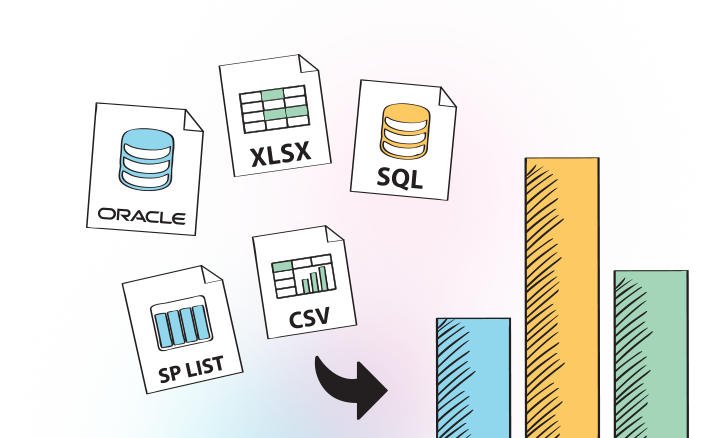
All of the data needed for a presentation may not come from the same type of data source. The IT team may use SQL Server or Oracle to store data, while data entry operators may only be able to use Microsoft Excel. Collabion supports both of those data sources, as well as SharePoint lists, CSV files, BDC, and many more through ODBC connectivity.

Dozens of charts of different types
Using the right type of chart with respect to the data is essential for putting together an eye-catching presentation. To help with that, Collabion supports as many as 56 different types of charts, from the basic line and bar charts to the specialized Marimekko and Pareto charts. Hence, no matter which type of data is being used to make a chart, Collabion always provides the right kind of chart for that.

Data Filtering and Multi-level Drill Down
Applying custom filters to the source data is one of the best ways to extract actionable insights from a data source. Collabion lets users do that even during a presentation, with the changes reflecting on the charts instantly. Users may also apply multi-level drill down to focus on highly specific data buried within the tables/lists, displaying them on the chart to help decision makers.

Option to print charts quickly
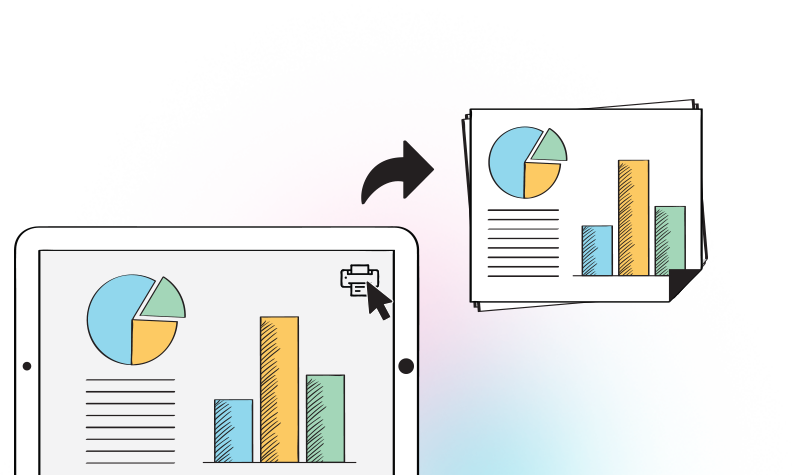
Printing out the charts that would not need to be modified can be helpful to users, since it will let them jot down notes/insights on the charts themselves. Besides, printed copies of such charts can also be included in the marketing collaterals, helping attendees prepare for the discussions beforehand. Collabion lets users print charts from within the program, speeding up the process.

Exporting charts in various formats
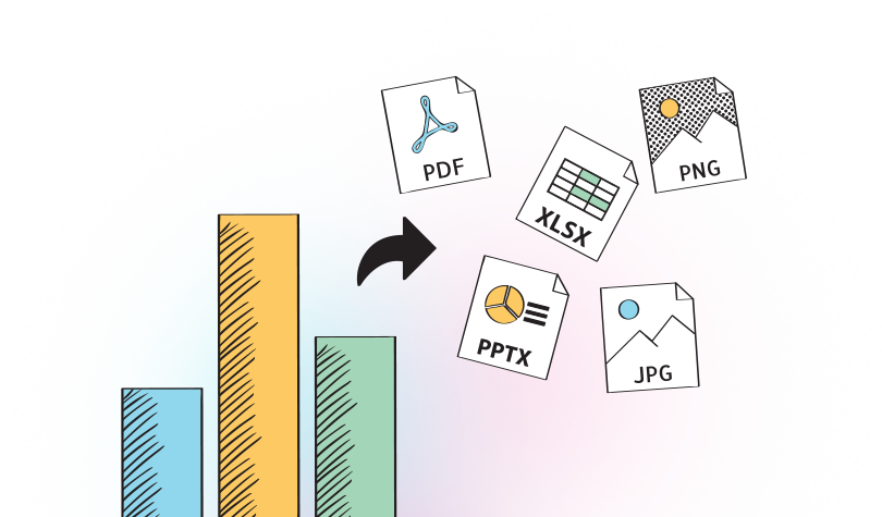
Once the charts are built, they can be exported to various formats from Collabion – from Microsoft PowerPoint presentations, Microsoft Excel spreadsheets, image files like PNG and JPG, and even PDF files. The files can then be modified using other software programs, or even attached to e-mails and send to attendees who could not show up at the meeting.

