 Introduction
 What is Data Visualisation
 How does It helps the Government?
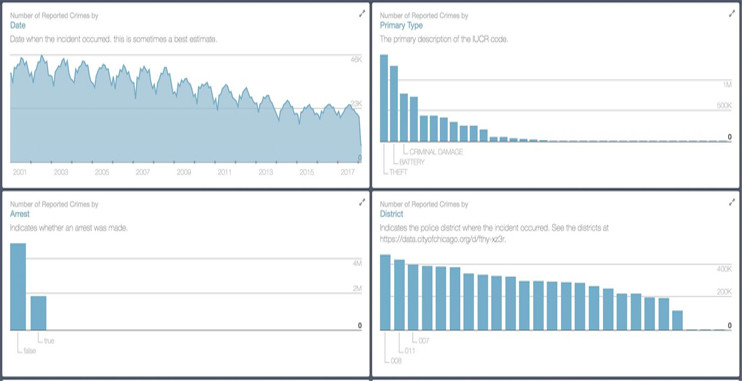
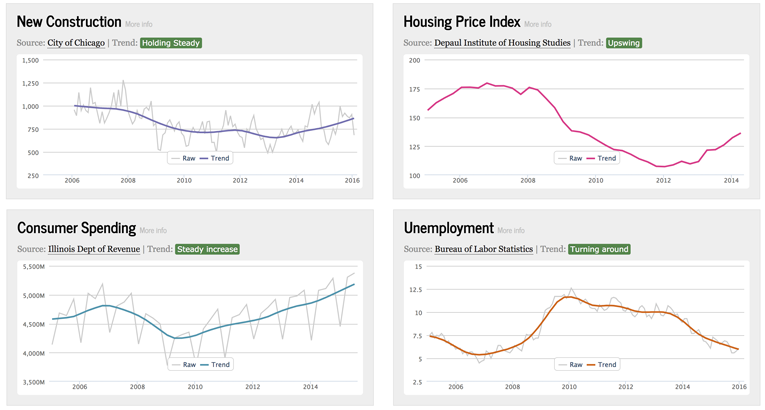
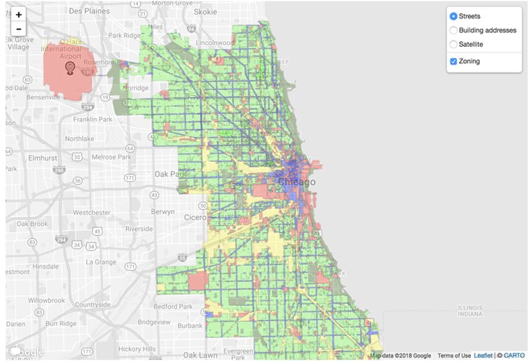
 Case Study: City of Chicago
 How to Start using DV in your agency
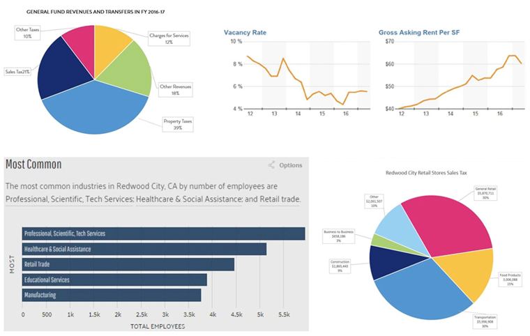
 Case Study: Redwood City
The digital revolution has broken all traditional barriers to communication, empowering the human race like never before.
At its early stages, this transformation was marked by global adoption of technology. Today we’re on a rapidly evolving curve where knowledge truly has become power. With data flowing in from multiple digital sources, decisions are intelligent, informed, and outcome-driven.
The economy and the people living in it are transitioning to knowledge-based industries. On an individual level, most of our daily tasks – commuting, paying bills, making purchases, or simply talking – are just instances of data, being processed smartly.
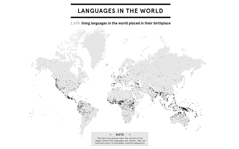
This interactive visualization from OurWorldInData lets you see how internet usage has grown in the world through the ages
However, with great power does come great responsibility. The average citizen now expects a lot more from the world around him, and government agencies must comply. People want to be aware of what’s going on at government levels, and have a say in the official decisions that impact daily lives.
Beyond the basic facts, these taxpayers also want to see exactly how well their government is doing – accurately measure its performance.
And most importantly, the current populace isn't ready to wait for days to access this information.
As UNESCO rightly claims, "There is (also) a need to focus on establishing partnerships, networks and an innovation system that enhance a country’s ability to share knowledge and information."" Clearly, an efficient, highly transparent government is the need of the hour.
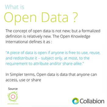
The upside is that most Government agencies already have a large reservoir of impactful data they can make Open .
Even as huge volumes of data sit idly in public-sector warehouses, leaders across the world are inking legislations that’d boost transparency and accountability – paving the road to data-driven governance. The US is the helm of this revolution, with several State and Federal Institutions already incorporating data-driven processes in daily operations (or have promised to do so in the near future).
But is it enough to simply show this data off to the public? The bigger the volumes, the harder it is to understand – this is the very nature of data. And unlike a computer, the human brain is not designed to process rows and columns of information, at a glance. So here is the bottom line: unless the data is put into a consumable format, all that information a Government agency has up its sleeve, becomes useless.
That’s where Data Visualization comes into play.