SharePoint is Microsoft’s No. 1 collaboration platform. Just like most other products from the company, it is also packed with lots of user-friendly features. Then why does it get a bad rap from many business owners out there? We searched for the answer and came up with a bunch of myths, which separate the expectations […]
Tag: sharepoint graphs
Top 5 SharePoint Myths Debunked
6 Reasons to Steer Clear of Folders in SharePoint
While Microsoft SharePoint does support folders for storing documents, many SharePoint experts discourage users from doing so, since it robs the platform of many of its advanced and flexible features. We did our own research on the subject and found 6 major reasons to avoid creating folders in SharePoint, which we have presented in the infographic […]
5 Do’s (and 5 Don’ts) for SharePoint that Every User should be Aware of
SharePoint is massive, and while it is definitely user-friendly, it is necessary to know the right way of using it, in order to properly utilize the powerful features offered by the platform. Here, we have compiled two 5 point lists of what to do and what absolutely not to do, for both admins and end […]
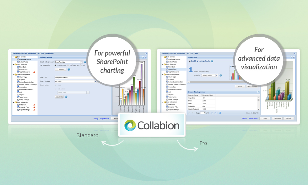
Collabion Charts for SharePoint – Now Available in 2 Powerful Versions
Tired of grappling with business data stored in various locations whenever you need to make charts in SharePoint before presentations? Then this is the best time to check out Collabion Charts for SharePoint. The recently launched latest version (2.3.0.0) of this popular enterprise charting solution is available in two powerful modes, one available for free […]
Navigating the data jungle: Collabion Charts for SharePoint helps you build charts with just about any data source
Data management with Microsoft SharePoint can pretty much seem like a nightmare in many leading MNCs, given the major diversities in the use of data storage software that can exist across different levels. That is why an enterprise charting solution that can connect to any of those platforms can be very helpful to data analysts […]


